PriyoPay
Designing a money app simple enough to use from anywhere
- Client
- PriyoPay
- Industry
- Fintech · consumer payments
- My role
- Product design lead at Ofspace
- Scope
- Mobile app, web dashboard, tablet, identity
Three jobs, one app.
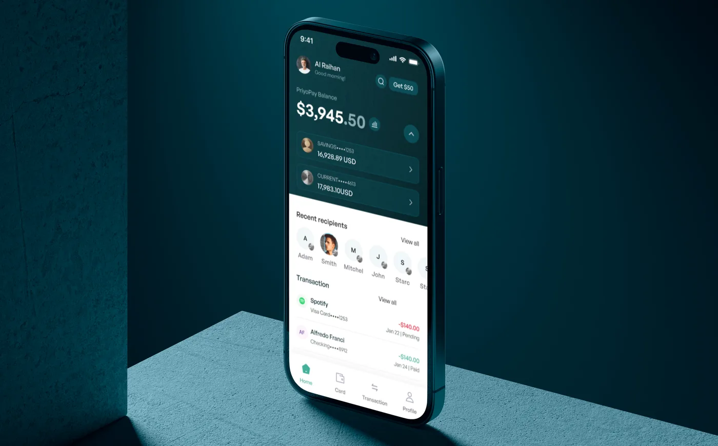
PriyoPay is a consumer payments product built around three everyday jobs: send or receive money from anywhere, pay regular bills like rent, electricity, water and phone without standing in a queue, and always know your balance.
I led the design at Ofspace from first concept to shipped product, across mobile, tablet and web.
Money apps that feel like paperwork.
For many of PriyoPay’s users, paying a bill meant visiting an office, and sending money abroad meant fees and uncertainty. The product had to feel trustworthy enough for money and simple enough for someone using a finance app for the first time.
Every core job a few taps from home.
I structured the app around the three things people come for — send, pay, check balance — so each is reachable from home in a few taps. Buttons and labels are explicit and instructions are short, because many users were new to managing money in an app.
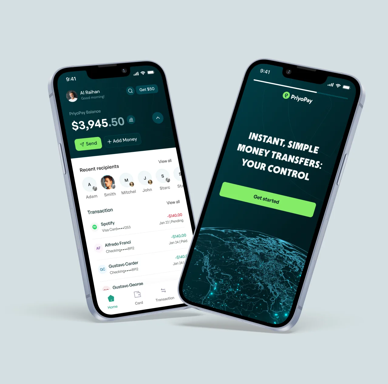
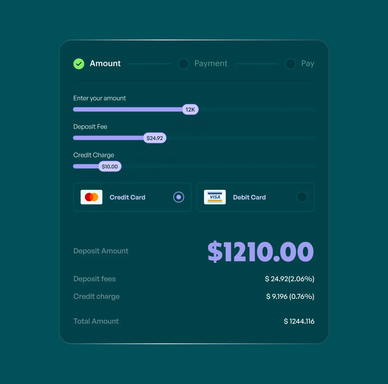
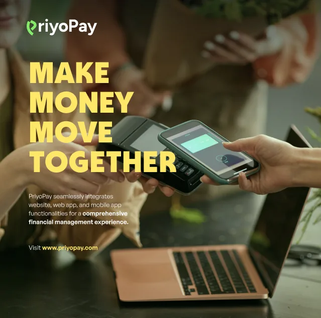
The same product on every screen.
People check balances on their phone and manage spending on a larger screen, so I designed the web dashboard and tablet layouts alongside mobile, from the same components.
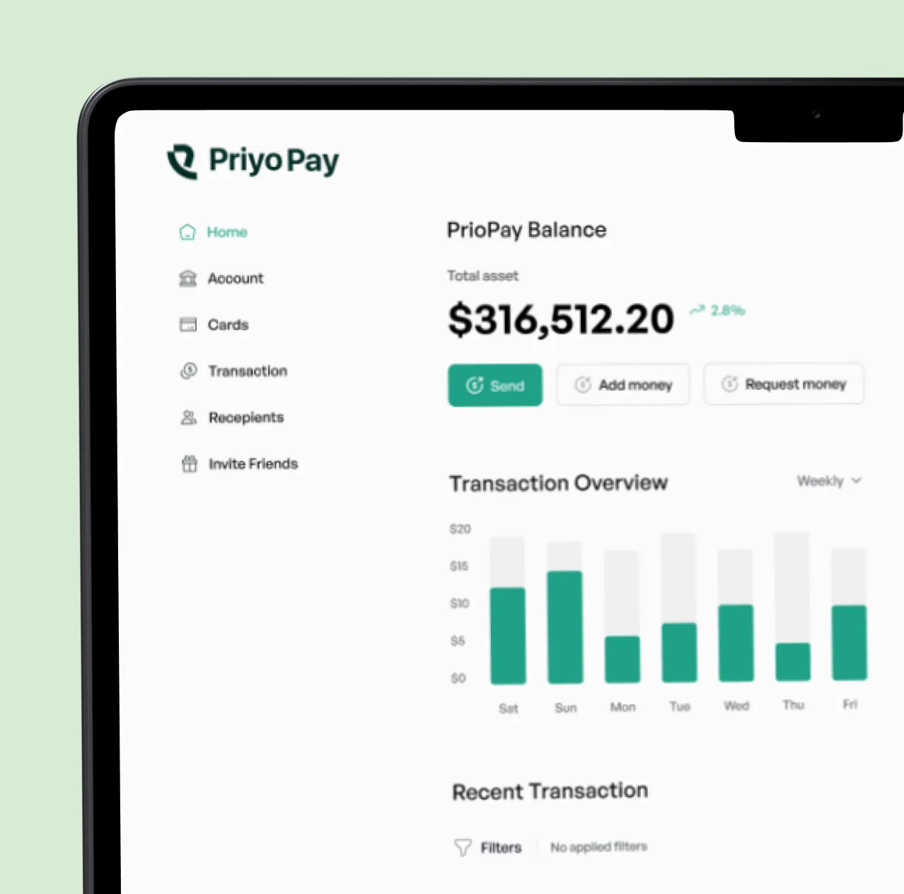
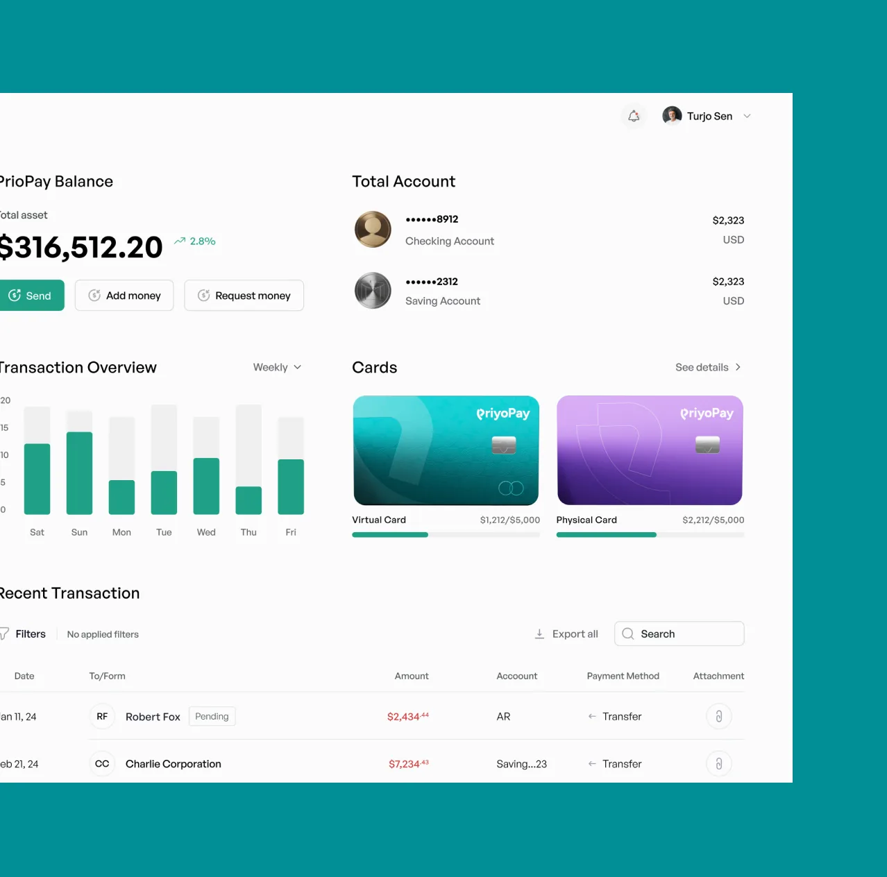
Illustration to explain, not decorate.
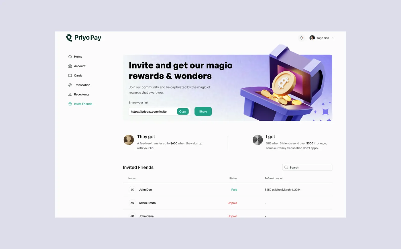
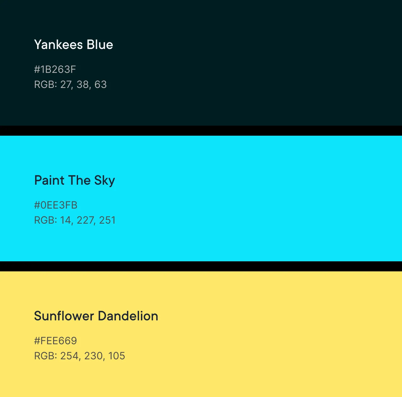
First-time users needed concepts like transfers, cards and invites explained without jargon. I used 3D illustration and a bright, high-contrast palette to make each concept recognisable at a glance, and kept the interface itself clean and quiet around it.
A product investors backed.
PriyoPay launched on mobile, tablet and web and raised a $100K seed round.
What I’d measure next: completion rate for a first international transfer, the moment that decides whether someone keeps the app.
More projects
Hiring a product designer, or untangling a complex product?
Let’s talk →